

AZUL RE-THEME
AZUL RE-THEME
AZUL RE-THEME
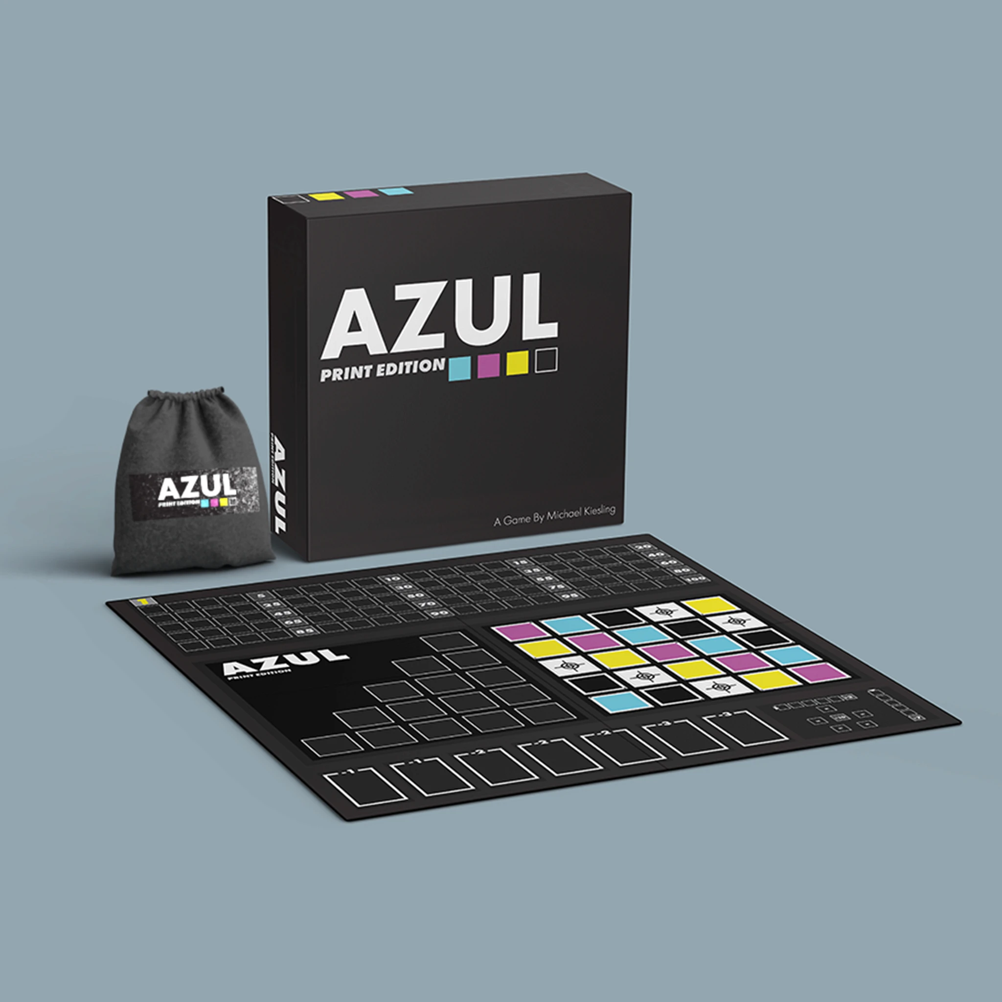

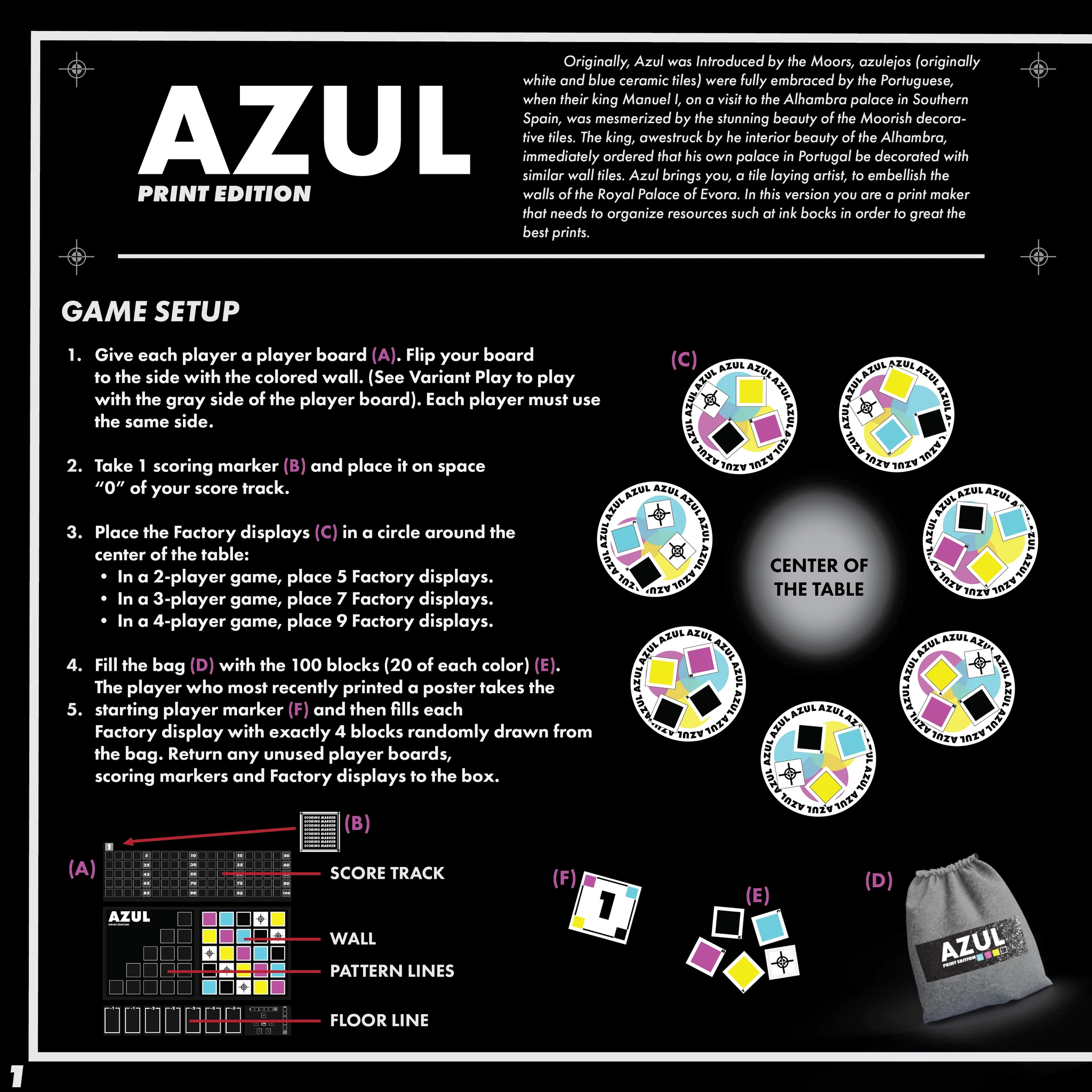
The goal for this project was to rebrand/new edition of the Azul board game. Azul (Portuguese for blue) is an abstract strategy board game designed by Michael Kiesling. Based on Portuguese tiles called azulejos, in Azul players collect sets of similarly colored tiles which they place on their player board. The Original design of this game has a very unique, colorful, handcrafted feel. Other editions of this game follow this same style.
For this edition, I wanted to go in the complete opposite direction from “handcrafted tile” to a digital print theme. Rather than a tile factory, a print factory. Man-made to machine-made. Instead of porcelain tiles, the factory uses ink cartridges. This also serves the notion of how the modern world leaving handmade craftsmanship behind and resorting to technology.
For design motifs, I chose general factors of printmaking. I wanted a simplistic contemporary theme that included Cyan, Magenta, Yellow, Black (CMYK), and registration marks. I felt these factors were important in establishing the motif.
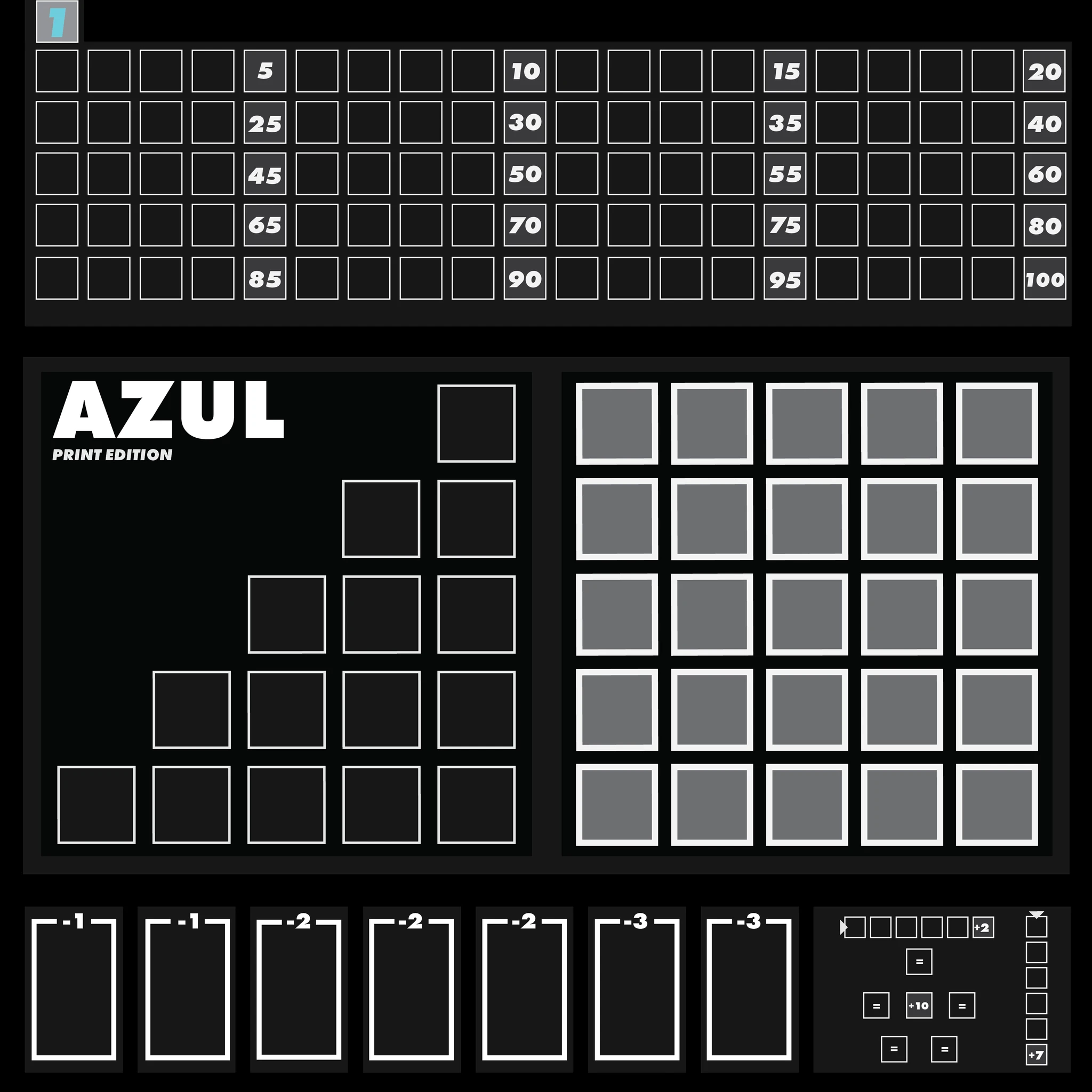
The game comes with two boards. The board on the left is the primary board, and on the right is the alternative board which is played with different rules. It was important to me to retain the layout of the original game while incorporating the new theme. This way, players would not feel as if they were playing a different game. As seen on the board, we can see printmaking themes with the CMYK and registration mark blocks.
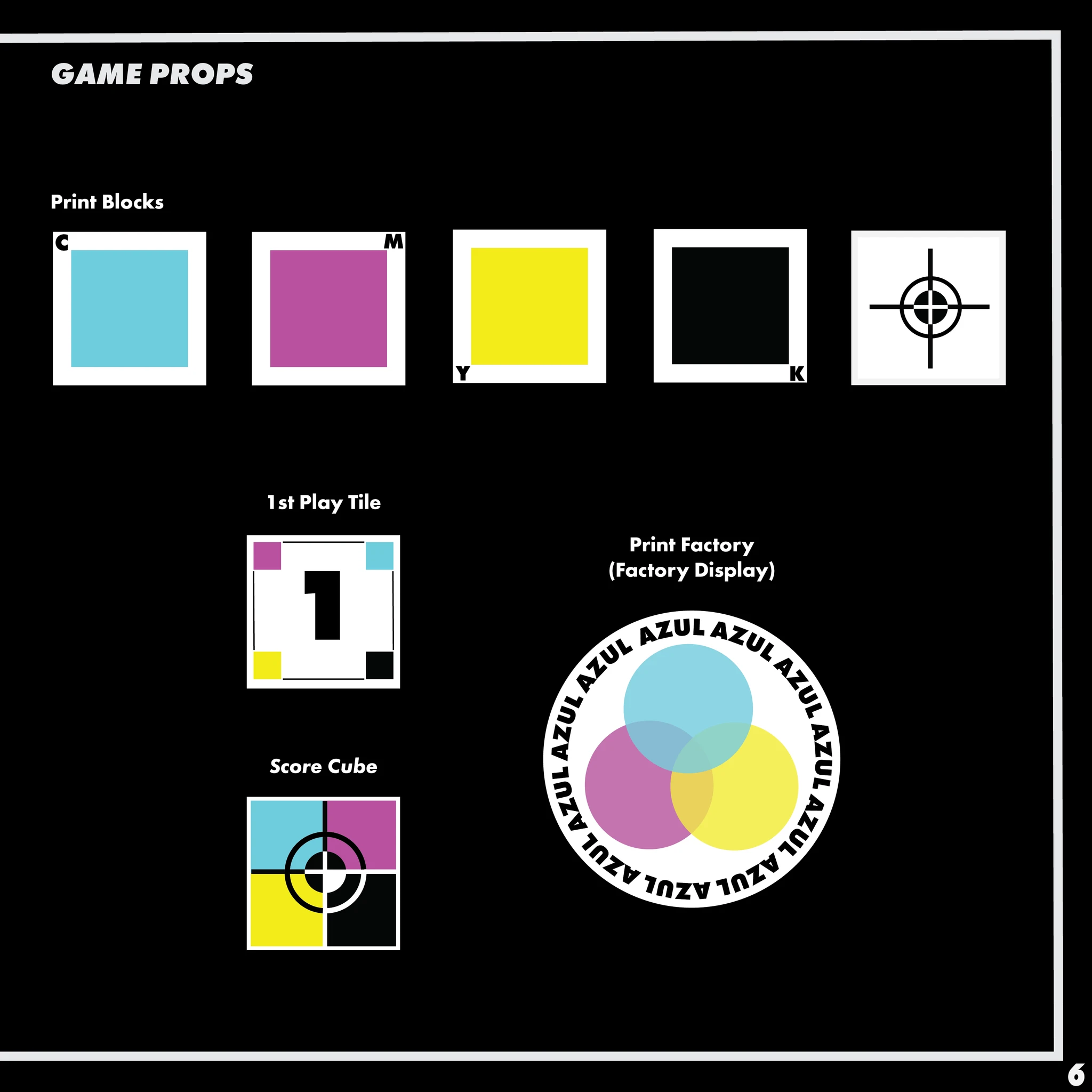
(P.. 6) are the game props. As seen, we have blocks representing the CMYK print cartridges along with a 1st Play Tile, Score Cube, and Print factory coaster that all display CMYK print themes.
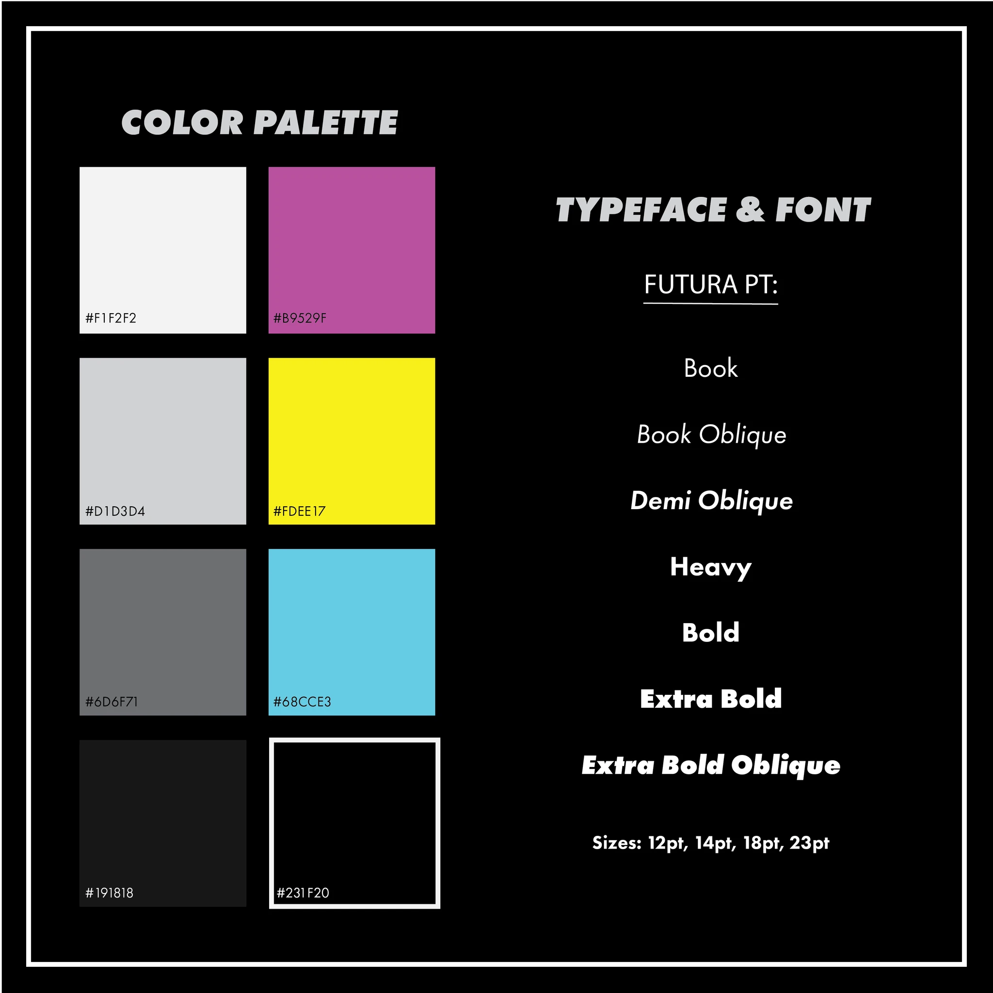
The last image is the design sheet which contains the color palette, typeface, and fonts used throughout the design of Azul Print Edition
The goal for this project was to rebrand/new edition of the Azul board game. Azul (Portuguese for blue) is an abstract strategy board game designed by Michael Kiesling. Based on Portuguese tiles called azulejos, in Azul players collect sets of similarly colored tiles which they place on their player board. The Original design of this game has a very unique, colorful, handcrafted feel. Other editions of this game follow this same style.
For this edition, I wanted to go in the complete opposite direction from “handcrafted tile” to a digital print theme. Rather than a tile factory, a print factory. Man-made to machine-made. Instead of porcelain tiles, the factory uses ink cartridges. This also serves the notion of how the modern world leaving handmade craftsmanship behind and resorting to technology.
For design motifs, I chose general factors of printmaking. I wanted a simplistic contemporary theme that included Cyan, Magenta, Yellow, Black (CMYK), and registration marks. I felt these factors were important in establishing the motif.
The game comes with two boards. The board on the left is the primary board, and on the right is the alternative board which is played with different rules. It was important to me to retain the layout of the original game while incorporating the new theme. This way, players would not feel as if they were playing a different game. As seen on the board, we can see printmaking themes with the CMYK and registration mark blocks.
(P.. 6) are the game props. As seen, we have blocks representing the CMYK print cartridges along with a 1st Play Tile, Score Cube, and Print factory coaster that all display CMYK print themes.
The last image is the design sheet which contains the color palette, typeface, and fonts used throughout the design of Azul Print Edition.
The goal for this project was to rebrand/new edition of the Azul board game. Azul (Portuguese for blue) is an abstract strategy board game designed by Michael Kiesling. Based on Portuguese tiles called azulejos, in Azul players collect sets of similarly colored tiles which they place on their player board. The Original design of this game has a very unique, colorful, handcrafted feel. Other editions of this game follow this same style.
For this edition, I wanted to go in the complete opposite direction from “handcrafted tile” to a digital print theme. Rather than a tile factory, a print factory. Man-made to machine-made. Instead of porcelain tiles, the factory uses ink cartridges. This also serves the notion of how the modern world leaving handmade craftsmanship behind and resorting to technology.
For design motifs, I chose general factors of printmaking. I wanted a simplistic contemporary theme that included Cyan, Magenta, Yellow, Black (CMYK), and registration marks. I felt these factors were important in establishing the motif.
The game comes with two boards. The board on the left is the primary board, and on the right is the alternative board which is played with different rules. It was important to me to retain the layout of the original game while incorporating the new theme. This way, players would not feel as if they were playing a different game. As seen on the board, we can see printmaking themes with the CMYK and registration mark blocks.
(P.. 6) are the game props. As seen, we have blocks representing the CMYK print cartridges along with a 1st Play Tile, Score Cube, and Print factory coaster that all display CMYK print themes.
The last image is the design sheet which contains the color palette, typeface, and fonts used throughout the design of Azul Print Edition

liampcreative@gmail.com
805-350-9811
liampcreative@gmail.com
805-350-9811
liampcreative@gmail.com
805-350-9811