

CALIFORNIA
COMMON
CALIFORNIA COMMON
CALIFORNIA COMMON


The logo sheet above is the concept I ultimately chose for this beer. The goal for this concept was to create a timeless logo that would attract any legal drinking demographics. I felt my other concepts didn't quite hold this trait. To create a timeless look, I drew inspiration for many large beer brands such as Budweiser, MillerLite, Peroni, Firestone Walker, and more.
For the design, I decided to create a California Mission as the focal point. California missions run up and down the entire coast of the state. I felt the mission correlated with the time the California Common was made. The mission brings a historic feel resembling the aged history of the beer. Missions in California were built in the 1830s, relatively the same time the Califonia Common was created.
For the color pallet, I wanted to incorporate golden yellows and deep blues which resemble the “Golden State,” hot sun, and cool Pacific Ocean. Lastly, I included a hop and barley leaves to establish that beer theme. For the base design of the can. I included a washed-out map of California that subtly indicates the location of every mission down the coast.
The last reason why I resorted to this logo is that it was legible in black and white, can be sized down, and is compatible with most merchandise/installments.


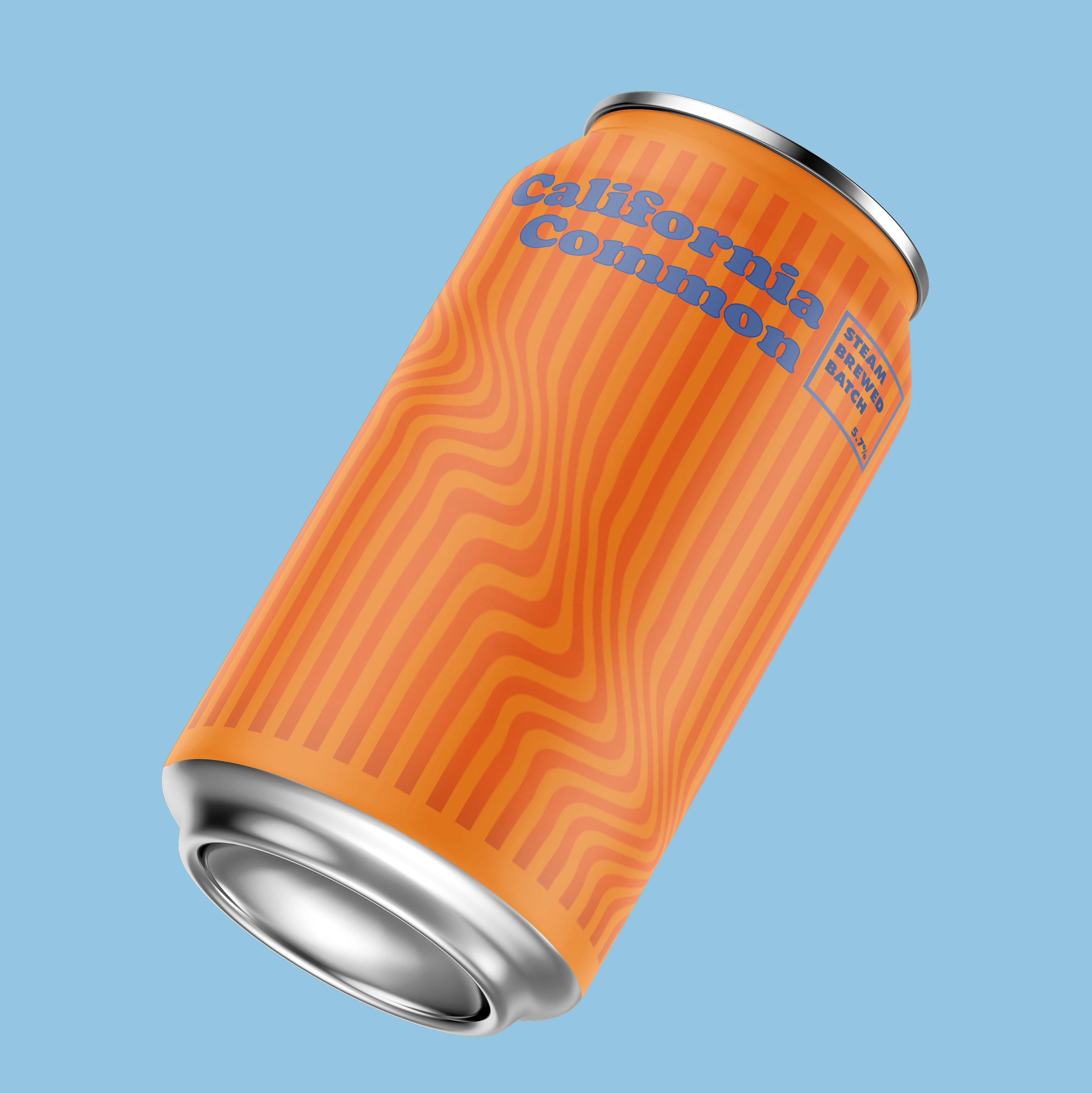
The concept below was more of an impulse idea as I was thinking of more styles I could experiment with. I wanted to create a clean contemporary look that portrayed the rays of the California sun along with the ocean. This is exemplified by the wavy oranges and blue accents. A goal with this was to also experiment with illusion.
The concept below was more of an impulse idea as I was thinking of more styles I could experiment with. I wanted to create a clean contemporary look that portrayed the rays of the California sun along with the ocean. This is exemplified by the wavy oranges and blue accents. A goal with this was to also experiment with illusion.
The concept below was more of an impulse idea as I was thinking of more styles I could experiment with. I wanted to create a clean contemporary look that portrayed the rays of the California sun along with the ocean. This is exemplified by the wavy oranges and blue accents. A goal with this was to also experiment with illusion.

Below is a concept that explores a prominent landmark of northern California to represent the California Common. I felt Big Sur was a great landmark to illustrate a hand-crafted look with warm vibrant colors to set the tone of what you are drinking when you taste the California Common. Furthermore, I felt that this motif paired with the name Sipp’n Sur gave a warm, beachy, relaxing vibe that portrayed what a California beer is meant to be.
Below is a concept that explores a prominent landmark of northern California to represent the California Common. I felt Big Sur was a great landmark to illustrate a hand-crafted look with warm vibrant colors to set the tone of what you are drinking when you taste the California Common. Furthermore, I felt that this motif paired with the name Sipp’n Sur gave a warm, beachy, relaxing vibe that portrayed what a California beer is meant to be.
Below is a concept that explores a prominent landmark of northern California to represent the California Common. I felt Big Sur was a great landmark to illustrate a hand-crafted look with warm vibrant colors to set the tone of what you are drinking when you taste the California Common. Furthermore, I felt that this motif paired with the name Sipp’n Sur gave a warm, beachy, relaxing vibe that portrayed what a California beer is meant to be.


liampcreative@gmail.com
805-350-9811
liampcreative@gmail.com
805-350-9811
liampcreative@gmail.com
805-350-9811